How to create a slick CSS animation from Star Wars

I will make a CSS animation of the iconic opening title sequence for the movie Star Wars. I focus on the “text crawl” portion of the sequence, which introduces the general plot. I will make it responsive.
TLDR
Here is the finished animation:
About the title sequence
It is probably the most well known title sequence there is. Nevertheless, here is a quick synopsis of it in 3 parts:
- There is an initial kind of fairytale introduction. Some blue text appears against a black background with the phrase: “A long time ago in a galaxy far, far away…”. The text fades out after a few seconds.
- The background switches to a starfield and the theme tune blares. The title comes into view moving along the Z axis away from us. It fades as it reaches a point in the horizon.
- The general plot is introduced. Three paragraphs of yellow text move along an incline away from us and fade out at a point in the horizon. This is often called the text crawl. This is the part that I will animate.
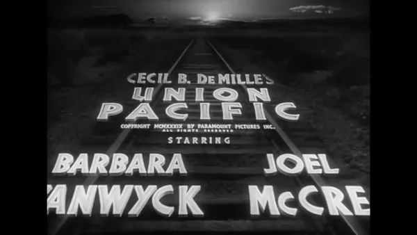
You can read more about the background of the title sequence in Art of Title’s article. It features a video of the title sequence, and a discussion with the Title Designer Dan Perri. The genesis of the sequence is interesting, actually the text crawl was largely lifted from an old film called Union Pacific!
Design
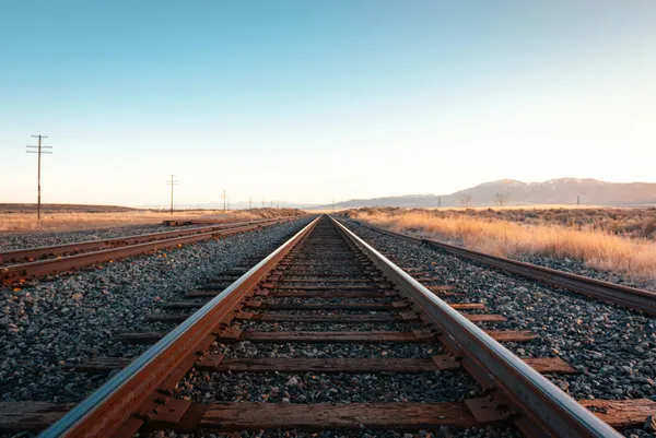
I think that sticking with the analogy of a railway track will simplify our design. Our text is the train, and it is moving along the track away from us. We are positioned in the middle of the track looking along it.
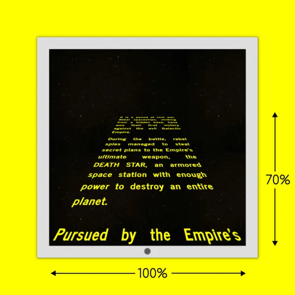
The proportion of the screen that the text occupies is a big facet of the effect. It should occupy 100% of the screen width and approxmiately 70% of the screen height. It is a constraint that we should try to follow as closely as possible. It affects the magnitude of the text looming into view.
We need to factor the aspect ratio of the screen into the track size. The portrait mode of a mobile screen has a lot more vertical real estate than horizontal. For example, an iPhone 17 has an aspect ratio of 9:19.5; whereas an iPad Pro 13 has an aspect ratio of of 3:4. If we want the text to occupy 100% of the screen width, it will take up less vertical space on mobile. It is probably a good idea to treat it as a special case, and adjust the rotation of the track and font size to compensate a bit for this. On tablets and larger screen sizes, there is less variance in the aspect ratio.
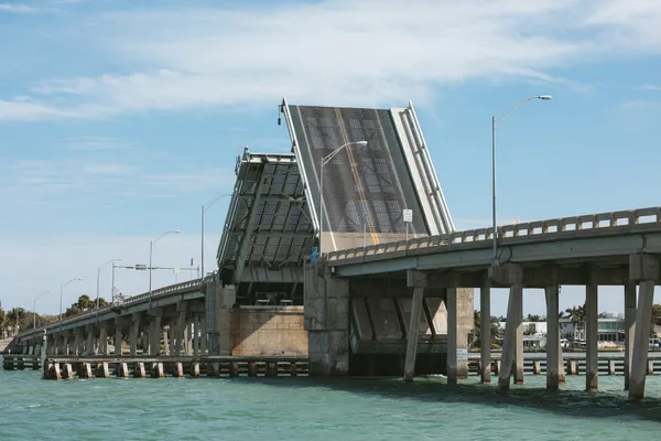
In terms of achieving the effect, it is like a drawbridge in an elevated state. We must tilt (rotate) the track along the horizontal axis somewhere between 30 and 60 degrees depending on the chosen perspective.
It is best to make a “track” element that locks in these dimensions and limits the space the text can occupy. The text will be a child block. The track should look something like this:
We want to maintain a proportional text size across screen widths. Each line should be a maximum of approxmiately 22 characters long. We will need to make the typography fluid (responsive) to keep this consistent.
We want the text justified. We want the last word of each line to be as far right as it can be.
I chose the News Cyle typeface. It is a realist, sans-serif typeface. It is in the ballpark of what was used in the original.
We will cap the dimensions of the track. Perhaps, full HD (1920x1080) could be the maxium size. The track will be centred horizontally and aligned on the bottom of the screen vertically. So on very large screens, its size and position will be constant.
Implementation
This is a 3D animation. The track is our path. The text block is the train.
Let’s start with the HTML, and work our way through the various aspects of the styling.
Base HTML
Our base HTML is below. Not much to explain here. Since we want to animate the 3 paragraphs as a single unit, we surround them with a “text-wrapper” element.
<div class="track">
<div class="text-wrapper">
<p>
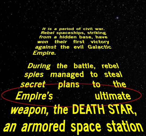
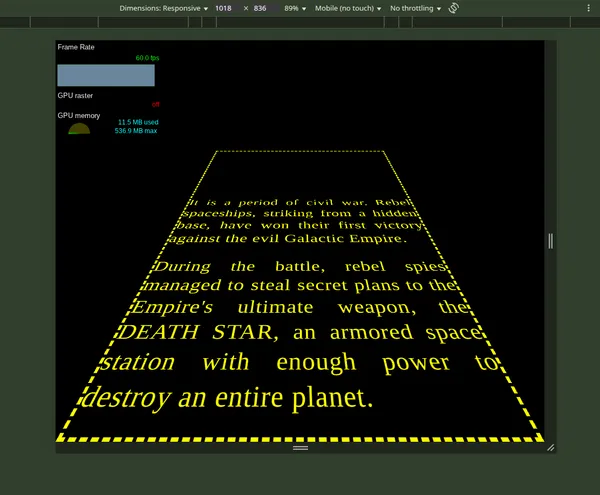
It is a period of civil war. Rebel spaceships, striking from a hidden
base, have won their first victory against the evil Galactic Empire.
</p>
<p>
During the battle, rebel spies managed to steal secret plans to the
Empire's ultimate weapon, the DEATH STAR, an armored space station with
enough power to destroy an entire planet.
</p>
<p>
Pursued by the Empire's sinister agents, Princess Leia races home aboard
her starship, custodian of the stolen plan that can save her people and
restore freedom to the galaxy....
</p>
</div>
</div>Setting up our 3D Canvas in CSS
To make a 3D animation, we need a 3D “canvas”. We choose a viewing position/lense like we would if we making a video with a camera to decide what our view of the object is. We set this through the perspective property.
We want there to be some distance between us and the text in order to see a good portion of it. It is easiest to use the body as our 3D canvas. A good starting point might be perspective: 300px.
Some other bits about our “canvas”:
- We want it to cover the entire screen.
- We don’t want any margins. There is a default margin on
bodyin most browsers (vendor stylesheets). - We want to hide the text when it is offscreen. We can set
overflow: hiddenonbodyandhtmlto do this. - We want to centre the track horizontally. It easiest to make it a grid layout and use
justify-items: center.
html, body {
  overflow:hidden
}

body {
  perspective:300px;

  /* it is 100% wide by default */
  height: 100dvh;
  margin: 0;

  /* center track horizontally */
  display: grid;
  justify-items: center;
}
We will revisit this later to limit the dimensions for very large screens.
Create the elevated track
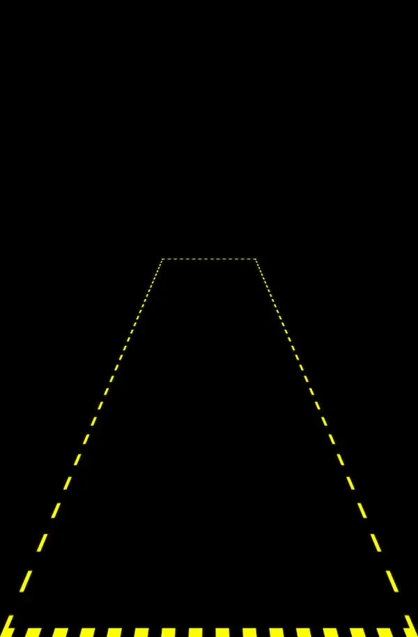
Our “track” element defines the path the text will move along.
It should have a width that covers approximately 100% of the screen width (a bit bigger is fine), and a height that covers about 70% of the screen height. Since objects that are closer to us appear bigger, setting width: 100% will not cover the width of the screen. We need to adjust the width and height according to the perspective we set to determine how space it occupies on the screen.
We want the track to be anchored to the bottom of the screen. We will position it absolutely relative to the body, and set bottom: 0.
We want to rotate the track like a drawbridge, away from us. We want the origin (of the rotate transformation) to be the bottom of the track, so we set transform-origin: center bottom on it. The rotation is along the X axis (horizontal), we can try rotate: x 45deg to see how it will look.
.track {
  /* anchor to bottom of screen */
  position: absolute;
  bottom: 0;

 /* actual size on screen will differ */
  width: 100dvw;
  height: 70dvh;

  /* guesstimate of rotation */
  rotate: x 45deg;

  /* visible outline for debugging */
  border: .5rem dashed yellow;
}
We will give it a yellow dashed border to form an outline and see how it looks.
It’s not too bad, but we need to tweak the values. It is easier to make CSS variables of the values that we want to tweak and play with those values in the browser. I made a playground below for you to try out different values.
We want to use relative units for the dimensions to scale with the available space, you can use viewport units (dvw and dvh) or percentages. Using percentages will work the same in this instance, be careful with percentages because 100% can mean different things in different contexts! I chose viewport units because when animation time comes around, we want to know the height of the track to move the text the correct distance. When animating the track, if we use 100% it refers to its own height.
This is where I landed:
:root {
  --perspective: 600px;
  --track-width: 100dvw;
  --track-height: 140dvh;
  --track-rotation: 45deg;
}

@media only screen and (min-width: 640px) {
  .track {
    --track-height: 160dvh;
    --track-rotation: 50deg;
  }
}
I will reassess this when I work with the text.
The text wrapper
We want the text content to be on the same plane as the track, and to be positioned just offscreen below the track.
<div class="track">
  <div class="text-wrapper">
    <p>It is a period of...yada</p>
    <p>During the battle,...yada</p>
    <p>Pursued by the Empire's ...yada</p>
  </div>
</div>
We position the text wrapper absolutely relative to the track, and set it to the end of the track through bottom: 0;.
Also, we want to remove the leading and trailing margins on the text block. This will impact the distance we want to need to move the text in our animation.
We want to adjust the font size of the text to fill out the vertical space like the original. To do this consistently across different screen sizes, we need to make the typography fluid/responsive.
We want the text to fill the entire width of every line i.e. justify the text. In the original, it looks like it is done by hand, spacing is added between letters and the words to try to evenly distribute everything. We will take an easier route and use text-align: justify to let the browser space out the words to fill the line. We can make some smaller adjustments to the space between letter with letter-spacing also.
.text-wrapper {
  text-align: justify;
  letter-spacing: 0.075rem;
}
Make the font size fluid
You can pull off fluid typography by using the clamp() CSS function with relative units as the value for the font-size property. There are a tonne of a calculator apps to help you get the saleable value (middle value) for clamp(), you need to work out the min and max values yourself by testing in the browser.
.text-wrap{
  font-size: clamp(2.1rem, 5vw + 3rem, 10.2rem);
}
To make a long story short, using this method does not yield the desired result consistently across screen sizes. With justified text, we can get some ugly holes whenever a line contains 2 words. This happens when the font size gets to a level that forces some longer words onto the next line. It is very dificult to avoid this with fluid typography.
The alternative route is to pick some breakpoints and pick fixed values for each breakpoint. This stepped approach keeps the font size at a level that prevents this issue.
/* Smallest devices - Default */
.text-wrapper {
  font-size: 2.1rem;
  letter-spacing: 0;
}

/* Large phones (640px and up) */
@media only screen and (min-width: 640px) {
  .text-wrapper {
    font-size: 3.4rem;
    letter-spacing: 0.1rem;
  }
}

/* Tablets (768px and up) */
@media only screen and (min-width: 768px) {
  .text-wrapper {
    font-size: 4.1rem;
  }
}

/* And so on */
Animating the text
To position the text wrapper off-screen, we use a translation on the Y axis of 100% to push it just below the track (100% is the equivalent of its height) i.e. translate: 0 100%.
To bring the text into view, we are animating the translate property along the Y axis to push it all along the track. We want it to move beyond the upper edge of the track to vanish into the distance. The final value of the animation should correspond with the approximate height of the track.
To make the text vanish at its top edge, we can add overflow: hidden to the track. If you want to add more polish, you can make the vanishing point tapered so it appears to fade out more gradually. See Adding more polish section for more on that.
Limiting the size
Our track is sized relative to the screen size.We want to limit this at a certain point.
I discuss performance later, for this reason I decided to cap the width at approxmiately 1200 pixels. If someone is looking at the animation on a screen larger than 1200 pixels, we want the track to be centred horizontally and aligned with the end of screen.
We already made our body a grid container. We align the track by using justify-items for horizontal alignment and align-items for vertical alignment. We then set max-width on the track to limit the size.
body {
  display: grid;
  justify-items: center;
  align-items: end;
}

.track {
  /* because its in a 3D canvas, value does not turn out exactly as 1200 pixels */
  max-width: 1200px;
}
Adding more polish
If you want to go the extra mile to make it look more polished, read on.
The tapered vanishing point for the track
overflow: hidden instead. We want to gradually fade out the text when it reaches the horizon. A mask can be used for this effect. A mask can control the visibility of any part of an element.
By using a linear gradient as the source image of the mask, we can control which parts are visible, partially visible, and are invisible. The default mask mode for gradients is alpha (transparency). Wherever the mask is opaque, the corresponding part of the masked element is visible; wherever the mask is fully transparent, the corresponding part of the masked element is hidden.
If we want the bottom 10% of an element to be invisible we can use hard stops like so: mask-image: linear-gradient(black 90%, transparent 90%);, see box 1 in figure below. It effectively clips the element.
If we want the bottom 10% of element to fade out, to gradually go from visible to invisible, we omit the second stop: mask-image: linear-gradient(black 90%, transparent);, see box 2 in figure below.
In our case, we want a small portion on top to gradually fade to invisiblity. We need to reverse the direction of the gradient to do this. Something like this will do to make the taper zone span 10% of the top of the element:
.track {
  mask-image: linear-gradient(to top, black 90%, transparent);
}
It easier to see this with a minimal example with a larger taper (20% of top):
We do not need to set overflow:hidden on the “track” element now!
Performance
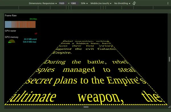
If you animate the text along the track, it runs consistently at 60 frames per second.
There is a performance issue in Chrome, but not in Firefox as far as I can tell. The bottleneck is the vanishing point. When we set overflow: hidden on the track element, Chrome starts to drop frames as the text approaches the vanishing point. On tablets and smaller viewports, the drop is minor. For larger viewports the frame rate drops to 30-35 frames per second. For a slow-moving animation this is acceptable, but it is a tiny bit janky.
Using a mask to create the vanishing point is worse. The frame rate drops to around 15 frames per second.
Adding will-change: translate to the text wrapper does improve the frame rate slightly. The will-change property gives a hint to browsers how an element is expected to change. It allows the browsers to set up optimisations.
There isn’t something that I can think of that would improve the performance outcome of this CSS animation. Perhaps it is a bug in Chrome. All I can do is restrict the width of the track to stay within our happy frame rate range across browsers. I decided to set the maximum width of the track to 1200 pixels to maintain a high level.
For superior performance, you would need to try it as a WebGL animation in JavaScript. It would be interesting to try that another time.
Title sequence demo collection
You can check out all of the animations in this series in this demo collection.
Final thoughts
It amazes me that such a simple dynamic can feel so impressive. The animation itself is very simple, it is just moving the text in a vertical direction (a translation). The hurdle is comprehending the nature of doing something in 3 dimensions. The setup is hard bit.
The most challenging part is making it responsive. The unique combination of constraints makes it a bit tricky. With modern CSS, no hacks are required with the layout. We are lucky on that front.
I find it useful to document approaches on this kind of layout and animation. It is easy to overlook or forget the challenging aspects. Good design decisions led to a shorter, more digestible implementation. Maybe you will look at the same code in the future and wonder why the hell you did what you did!
Thanks for reading!