Revising best practices for the video HTML element

The video HTML element is slowly falling in line with the img and picture elements. Should we revise our best practices for video? What are the best practices for video on the web? 😅
Lazy loading
Lazy loading media files is a big performance win. We would like to defer loading media files that are outside of the initial viewport. This behaviour has been normalised for images, but not for videos. Is this because most videos on the web are YouTube embeds?
It has been possible to lazy load a video in HTML through the preload attribute for a long time. However, there are limitations with this method. For example, it always loads a video if the autoplay attribute is also present.
<!-- previous method -->
<video preload="none" poster="img/cover.jpg" controls>
  <source src="screen-recording.webm" type="video/webm">
  <source src="screen-recording.mp4" type="video/mp4">
</video>
Now, you can use the loading attribute on the video HTML element to lazy load a video. Videos lazy loaded in this way will never be loaded until they are visible in the viewport (approxmiately).
<!-- new  method -->
<video width="600" height="300" loading="lazy" controls>
  <source src="screen-recording.webm" type="video/webm">
  <source src="screen-recording.mp4" type="video/mp4">
</video>
It is best to consider this feature a progressive enhancement for the moment. Browser support for this feature is limited to Chrome currently.
developer-signals repo to indicate your interest in the feature being available in all browsers. The Interop project uses this an input for choosing which features to pick.We need to be careful with lazy loading video. When it is in an unloaded state, it has a width and height of zero. When it is loaded, it will cause a cumulative layout shift (CLS) if it does not have an explicit width and height. Does this sound familiar?
We can apply the same treatment of lazy loading to video as we do to images, eventually.
Width and height
It is recommended to always have explicit width and height attributes on the video element to ensure that a cumulative layout shift is avoided. [1] [2]
Similar to images, it would be beneficial to have your framework/stack add the width and height attributes to every video element on your behalf.
Responsive video
Often one big video file is being served to everyone. Ideally we would like to serve identical video content, just a larger or smaller video depending on the device’s viewport width and resolution. I discussed this responsive video problem in a previous post.
You can use the media attribute on the <source> element to provide a media query to conditionally serve a video file depending on the browser’s width, resolution, or orientation. Something like this:
<video>
	<source src="/video/small.mp4" media="(max-width: 599px)">
	<source src="/video/large.mp4">
</video>
There is a proposal to add support for the srcset and sizes attributes for video files to the HTML standard. It works the same as for picture. It would be good to see this move forward.
Accessibility
The Web Content Accessibility Guidelines (WCAG) standard provides guidance. It is more involved than with images. Providing alternative text description is done with subtitles and captions.
One reason that people like to use YouTube for hosting video is that it automatically creates subtitles for a video. Cutting out manual labour is appreciated! This is more of a norm now fortunately.
Are best practices for video being taught/discussed adequately?
Not from what I have see online!
A good example was the removal of media support for video from browsers and the spec. This effectively meant that there was no frontend solution for responsive video on the web. This went under the radar.
It was Scott Jehl that asked for the feature to be added back. Coincidentally, Scott is one of the few people that I have seen on the web talking about standards and best practices on video (check his blog).
Education on video is underwhelming. For example, take a look at the Learn HTML! course on web.dev. If you compare the learning modules on images with audio and video, there is a noticeable difference in what is covered. There is no discussion on responsive practices or performance considerations for video. MDN’s core module on audio and video is similar. These are significant topics to overlook.
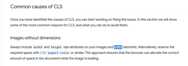
I have noticed some disregard for video in web dev circles. For example, on web.dev’s Optimize Cumulative Layout Shift article, the number one cause of CLS cited is Images without dimensions. The first line of that section says: “Always include width and height size attributes on your images and video elements”. Video is almost a footnote. Is this intentional?
Conclusion
Video is in the shadow of images in web development. Browser support and standards lag behind. Web frameworks seldom have video optimization functionality. Generally, best practices are not taught that well. It seems strange considering that video is the heaviest resource used on the web.
Perhaps, this is a reflection of how video is included on web pages. Is the go-to a YouTube embed? Is using a self-hosted video with the video element considered a last resort? Perhaps, devs are fraid that video will consume too much of their bandwidth allowance on their hosting plan.
Why isn’t there more urgency for getting video-related features such as lazy loading and the AV1 format into all of the major browsers? There is wide support for these features for images.
If we care about user experience and an open web, we should think more about how we use video on the web.
Optimize Cumulative Layout Shift (web.dev) - “Always include width and height size attributes on your images and video elements”. ↩︎
HTML video embed element (MDN) - “While explicit width and height attributes are recommended for all videos to avoid layout shift, they are especially important for lazy-loaded ones.”. ↩︎