Background overlay
Overlays are an additional layer between the content and the background. They are particularly useful when you’re trying to increase the contrast of text against a background.
This technique is a convenient one-liner. No modifications to the HTML or existing styles is required. This is perfect when you have less control over the codebase.
.overlay {
  border-image: linear-gradient(hsla(0, 0%, 0%, 0.2), hsl(0, 0%, 0%))
  fill 0;
}
Demo
Solution
The border-image property can be used for an overlay because it is painted above an element’s background and box-shadow but below the element’s content.
There are other ways to pull this off. The most widely-used approach is probably using pseudo-elements.
Explanation
The border-image property has quite a complex syntax! This is the syntax:
border-image: <source> <slice>/<width>/<outset> <repeat>;In our snippet, the <source> is the gradient, and the <slice> is fill 0. The other parts are omitted.
The <source> is the source image used to create the element’s border image. We use a gradient rather than an actual image. Nothing complicated there!
The <slice> is the dimensions for slicing the source image into regions. It is used to split the source into nine regions. The middle region is kept empty by default.

The above diagram illustrates the location of each region.
- Regions 1-4 are corner regions. Each one is used a single time to form the corners of the final border image.
- Regions 5-8 are edge regions. These are repeated, scaled, or otherwise modified in the final border image to match the dimensions of the element.
- Region 9 is the middle region. It is discarded by default, but is used like a background image if the keyword
fillis set.
Four slice lines, set a given distance from their respective sides, control the starting position of the regions. It is the interplay of the <slice> (border-image-slice property) and the <width> (border-image-width property) that influences how much of the slices we see.
Our goal is to have one slice (slice 9) in the middle region take up the entire area of the element. We want the regions 1-8 to have a <slice> of zero and a <width> of zero, so that they are nothing!
Let’s look at a few scenarios to understand border-image-slice and border-image-width better and see how it can get us to our goal. We will use a rainbow gradient as the border-image-source.
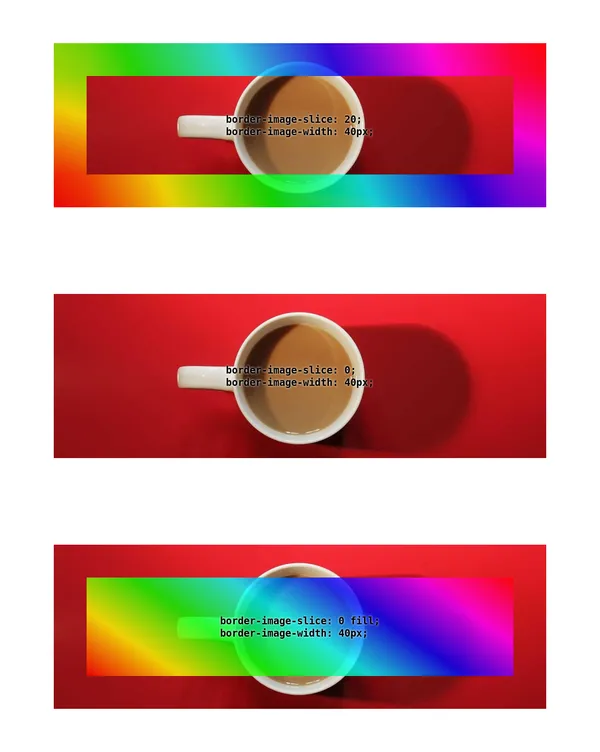
border-image-slice and border-image-width.In figure 1, you can see the following 3 scenarios:
- When the
border-image-slice:has a single positive value andborder-image-widthhas a value of 40 pixels, there is a 40 pixel rainbow border around the edge of the element. - When
border-image-slicehas a value of zero, there is no visible border. - When
border-image-slicehas a value of0 fillandborder-image-widthhas a value of 40 pixels, there is a transparent 40 pixel border around the edge, and there is a rainbow gradient in the middle occupying the rest of the element (slice 9).
Returning to our snippet, we set <slice> to zero. When a single value is specified, it creates all four slice lines at the same distance from their respective sides. Since all four lines have a distance of zero from their respective sides, this means regions 1 through 8 are positioned on the very edge of the visible area.
When we include the fill keyword, the middle region is populated with slice nine. You saw this in scenario 3 above. Since the other 8 slices have no width by default, slice 9 fills the entire area.
Attribution
Temani Afif came up with this. He published it on CSS Tip.